DSH Mobile UI





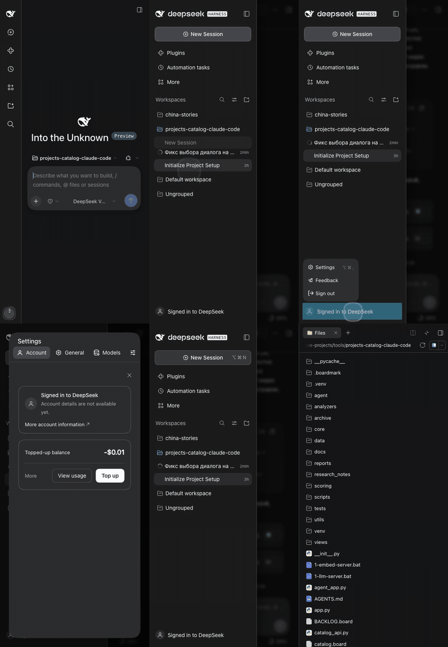

A phone-first fix for the DeepSeek Harness Web UI — a real drawer, edge swipes, readable settings and a working right panel, without touching the core.
DSH 0.2.x is desktop-first: a three-column grid, a 188px settings nav, a 0px right panel and a 14px composer that makes iOS zoom the page. On a phone that leaves a sliver of chat, unreadable settings and no way to reach Files or the code viewer.
- No more iOS auto-zoom — 16px fields on any touch device, even under a wide desktop layout
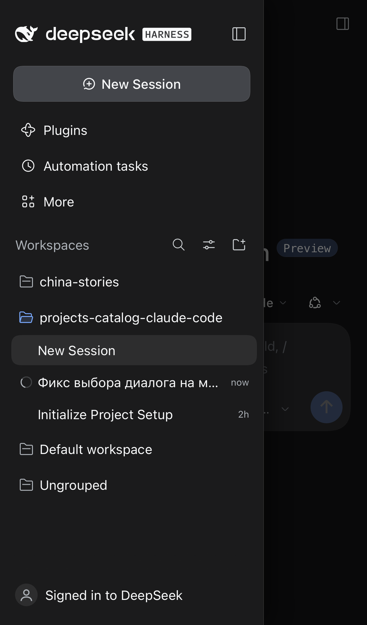
- The chat keeps the width — a 56px rail plus an overlay drawer, with edge swipes
- Everything else fits — settings, Files, terminal and the code viewer
No build step, no host code — one client module, MIT licensed.
What it fixes
| Sidebar drawer | Settings | Files and code |
|---|---|---|
 |
 |
 |
- iOS auto-zoom. Safari zooms a focused field under 16px. All
input/textarea/contenteditablebecome 16px on touch devices; the check is the device (html.dsh-mf-touch), not the viewport width, so a phone showing a stretched desktop layout does not zoom either.touch-action: manipulationkeeps double taps from moving the next tap off its target. - The chat keeps the full width. The sidebar column stays a 56px rail; the open panel becomes a fixed overlay drawer with a dimmed, blurred scrim.
- The drawer closes when you pick a session, when you tap outside it, and by its own close button. The bottom safe area is respected.
- Session rows open on the first tap. iOS treats a plain
<div role="treeitem">with a React handler as "not clickable" and holds its click for the double-tap window (~300ms). Closing the drawer first unmounted the row, so the tap only closed the menu. The row's click is now dispatched synchronously frompointerup, and the late native click of the same tap is swallowed. - Edge swipes. Swipe from the left edge to open, swipe left to close. Vertical drags stay with the scroller (36px threshold, 34px vertical drift, 24px edge zone).
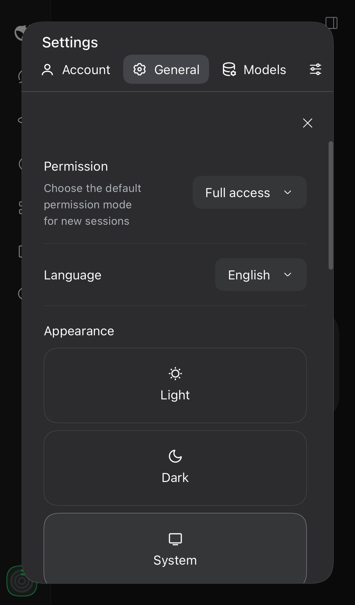
- Settings fit the phone. The desktop dialog keeps a 188px nav column next to the content — on a 390px screen that left ~150px. On narrow screens the section list becomes a horizontal, scrollable strip above the content, and the Account card stacks its identity above the "More account information" link instead of squeezing the name into a narrow column.
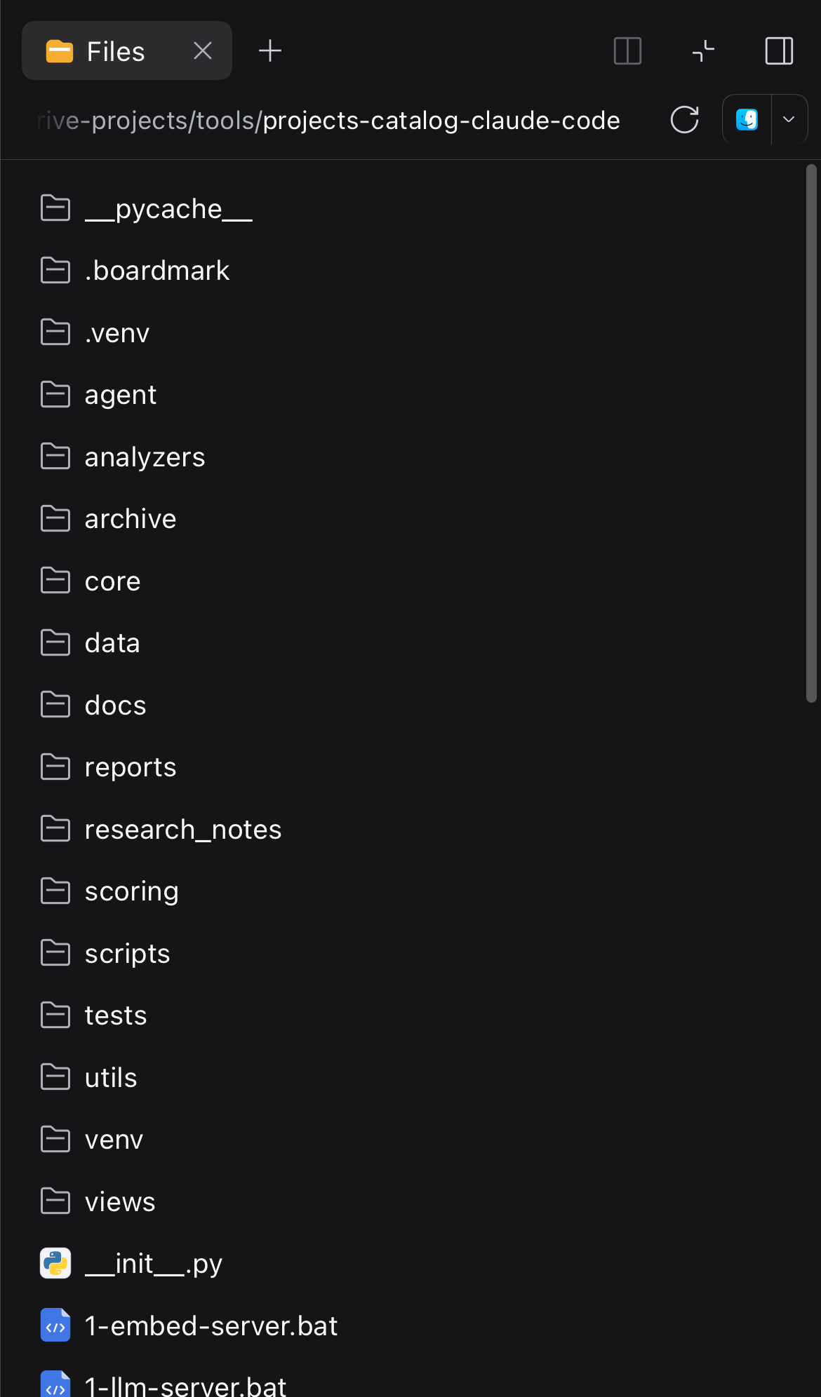
- The right panel works. Its grid track is 0px on a phone, so Files, Terminal and the file/code previews opened into nothing. While open (
data-sidebar-right-open) it becomes a full-screen sheet. - Code and tables stay inside the message and scroll on their own; code in the file viewer is 12px instead of 11px.
- The iOS keyboard accessory bar no longer sticks. In a standalone PWA iOS can leave the previous/next/Done bar pinned at the bottom after the keyboard is dismissed; the plugin drops the field's focus when the keyboard closes.
Install
git clone https://github.com/zven73/dsh-mobile-ui.git ~/.dsh/local-plugins/dsh-mobile-ui
dsh plugin --profile web add ~/.dsh/local-plugins/dsh-mobile-ui
dsh plugin needs pnpm on PATH. Restart dsh web (or let the profile re-compose) and reload the page on the phone. Client bundles are served from disk with a content revision, so later updates only need a page reload.
The package id stays
dsh-mobile-fix(the repository was renamed); that is the name you will see in~/.dsh/profiles/web/package.json.
Uninstall
dsh plugin --profile web remove dsh-mobile-fix
How it works
flowchart LR
  A[DSH web client<br/>0.2.x] --> B[client module<br/>lib/client.js]
  B --> C[stylesheet<br/>narrow + touch rules]
  B --> D[DOM hooks<br/>pointer · touch · click]
  C --> E[56px rail + overlay drawer]
  C --> F[settings strip · right sheet]
  D --> E
  B -. debug flag .-> G[off-screen rescue<br/>+ red banner]
The package is a plain DSH client plugin: cordis.patch.yml inserts one empty Host row, and lib/client.js is the browser bundle DSH serves through dsh.client. Everything it does is CSS and DOM events:
- selectors use the stable halves of the CSS-module names (
sidebarCol,centerCol,rightbarCol,sessionRow,_root,_collapsed,toggle) and the publicdata-slotnames; - the phone layout is behind
@media (max-width: 1023px), the 16px field rule is behind a touch-device class; - one registered listener set per page — a second
apply(HMR, live composition) replaces the previous one instead of stacking.
Compatibility
| DSH | Profile | Checked on | Status |
|---|---|---|---|
0.2.1-rc.5 |
web |
iPhone 14 viewport (390×844, WebKit) + a real iPhone PWA | tested |
other 0.2.x |
web |
— | expected to work; a large layout redesign may need selector updates |
| desktop ≥ 1024px | web |
macOS Chrome / Safari | untouched by design |
Troubleshooting
| Symptom | What to do |
|---|---|
| Page still looks desktop on the phone | Reload the page; check the plugin is in the web profile (~/.dsh/profiles/web/package.json → bundles) |
| Settings does not open, or opens off-screen | localStorage.setItem('dsh-mobile-fix-debug', '1'), reload, read the red banner |
| iOS still zooms on a field | Make sure the build is 0.6.3+ — the rule keys off the touch device, not the width |
| Drawer does not close on a tap | Try a real phone: desktop browser emulation fires click differently |
| Right panel is blank | Open it from the session header; the sheet is per session, not global |
| Session tap selects but does not open | Check the console for a JS error; the fix dispatches click from pointerup |
Limitations
- Selectors rely on CSS-module local names; a major redesign will need an update.
- The right panel is presented as a sheet on phones, not resizable.
- No service worker, no Host code: this is a client module only.
- Checked on iOS; Android Chrome should work (the layout rules are width-based) but is not tested.
Development
| Path | What it is |
|---|---|
lib/client.js |
the whole browser bundle: stylesheet, drawer logic, swipes, settings sheet |
lib/index.js |
empty Host half (a valid Loader entry) |
cordis.patch.yml |
inserts the plugin row into the profile |
docs/ |
screenshots and the demo GIF used by the READMEs |
Edit lib/client.js, bump VERSION and package.json, reload the page — the Host recomposes the bundle per request and the URL carries a content revision. There is no build step.
Contributing
Issues and PRs are welcome. Please describe the device, the DSH version and what exactly you saw; a screenshot of the phone helps more than a paragraph. For a fix, keep the desktop layout untouched and test at 390×844 before sending.
Changelog
See CHANGELOG.md.
License
MIT — see LICENSE.
No comments yet. Be the first to write one.