Aqua glass theme (community-maintained fork)
English | 中文
Upstream notice: this package continues from WYH66666666's DSH-Transparent-UI-Plugin (published on npm as
dsh-client-ui-aqua) at v1.3.0. The original author states he cannot keep up with new DSH APIs, so this fork fixes and adapts that code. It is not guaranteed to work with future DSH versions — back up your profile before upgrading DSH.
Supported DSH version
| Item | Value |
|---|---|
| DSH desktop / web | the whole 0.2.x line |
| Host client packages | @deepseek-ai/dsh-client-* 0.2.x |
| Declared range | package.json → engines.dsh: ">=0.2.1-0 <0.3.0" |
| Declared in metadata | package.json → engines.dsh: ">=0.2.1-rc.2 <0.3.0" |
V0.2.1-rc.2 is the version this release is built and verified against — the theme hooks are read from that host build (page-head markup, composer/dock seams, slot names). These are private client surfaces, so a DSH upgrade can break the look or the mount even though nothing changes here. If you are on another DSH build, treat the theme as unsupported and keep a profile backup.
Topics / community listing
Published under the dsh-plugin topic, so it shows up on the dsh-plugin community page alongside other DeepSeek Harness plugins.
dsh-plugin · dsh · deepseek-harness · deepseek-harness-plugin · theme · glassmorphism · aqua
Credits
| Item | Value |
|---|---|
| Original author | WYH66666666 — repository |
| Upstream npm package | dsh-client-ui-aqua (latest 1.3.1) |
| Base of this fork | upstream v1.3.0 sources |
| Maintained by | ZHUBAI0528 — repository |
| This package | @zhubai0528/dsh-client-ui-aqua-community-fix |
| Version | 2.0.5 |
| DSH support | >=0.2.1-0 <0.3.0 |
| License | AGPL-3.0 (inherited from upstream LICENSE; original copyright and licence notice retained verbatim) |
Aqua is a highly customizable glassmorphism theme for the DeepSeek Harness web UI and desktop app. The floating header, composer and stats line, and the trajectory view become panes of frosted glass, while the main column can sit on the living fluid board or on your own wallpaper (image or video); the sidebar keeps its stock look. Switch it off and the stock UI comes back exactly, with no source changes to DSH itself.
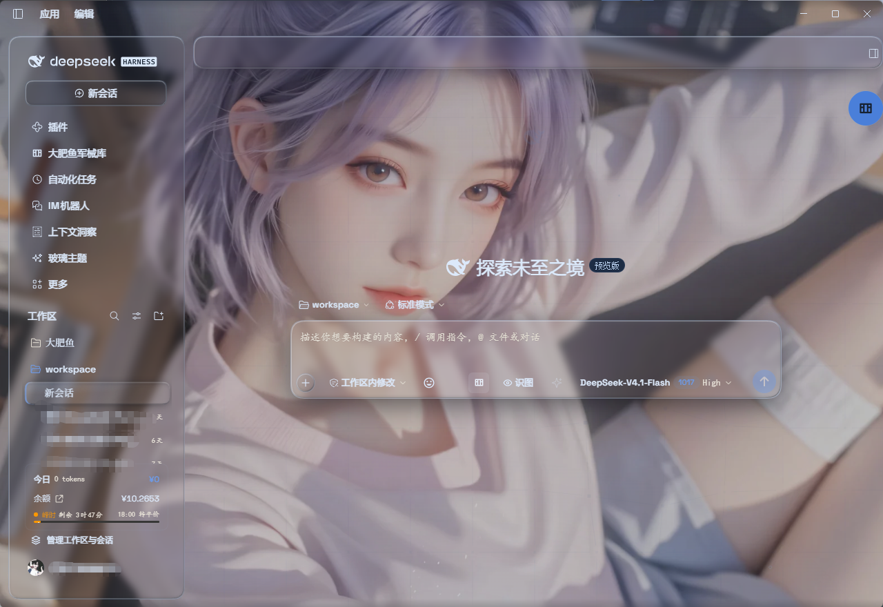
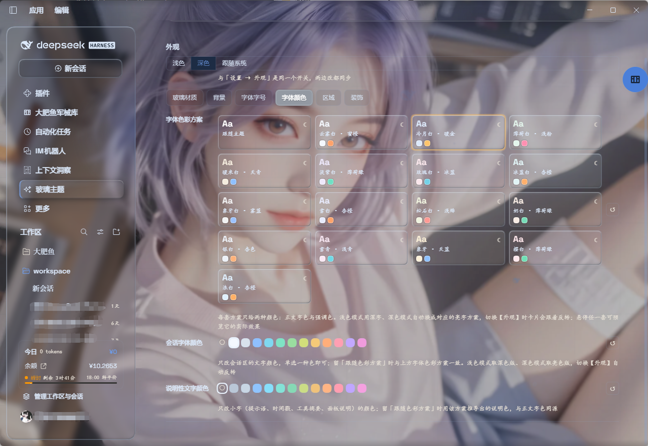
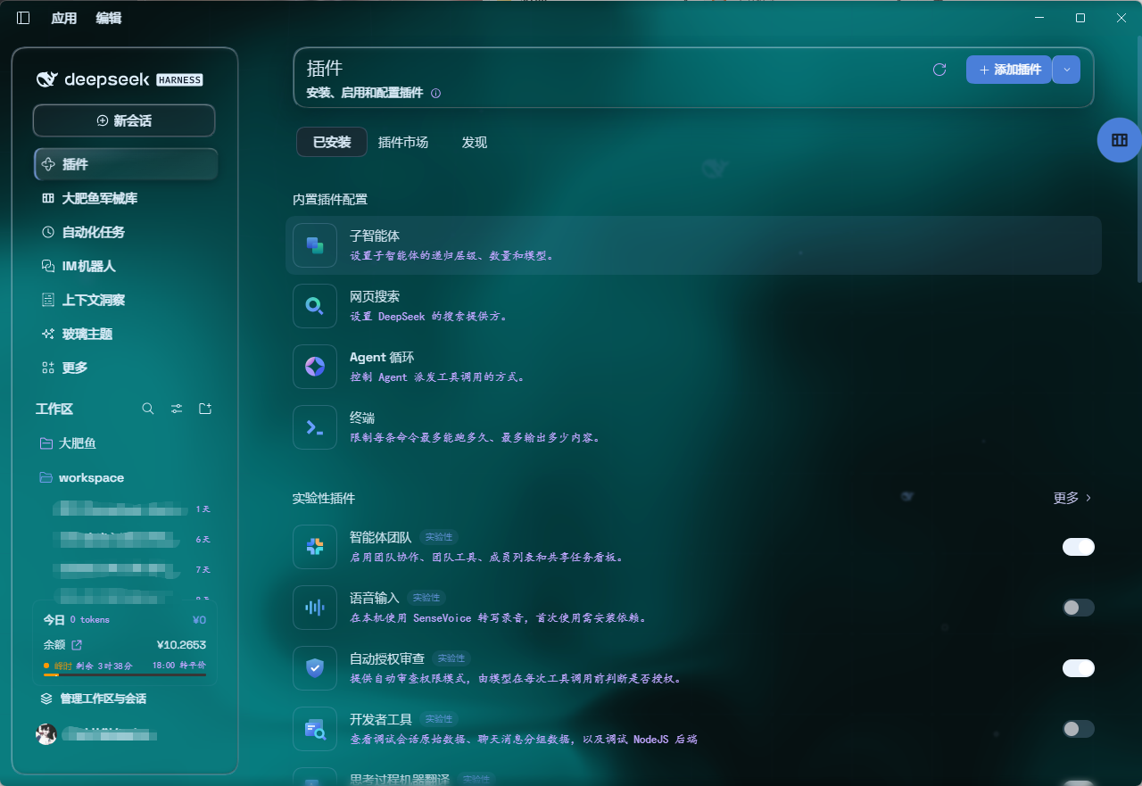
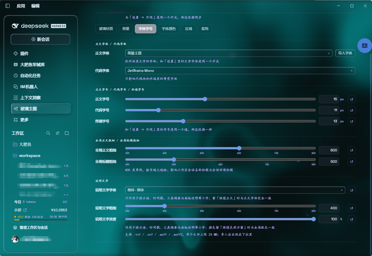
Differences from upstream v1.3.0
| Item | Upstream v1.3.0 | This package v2.0.5 |
|---|---|---|
| Layout modes | Mica + Compatibility, switchable | Mica only — compatibility mode and its selector are removed (tokens and styles too) |
| Edge blur bands | 5px gradient blur bands at the top/bottom (an upstream feature) | Removed — they read as an extra gradient wash over the page edges; readability is carried by the column veil instead (the 13px edge fade stays) |
| Submenu opacity | not available | New setting, default 96%, a fill stop alongside the chat slab veil |
| Submenu click | opens on hover, then a click closes it | New "click keeps it open": a hover-opened submenu survives the click and closes on the next one; works at any depth via ARIA, keyboard Enter unaffected |
| Popup material | 62% × frost fill (≈8.7% by default), text behind was legible through it |
96% fill + blur + 4px, panels no longer show the text behind |
| Composer and stats line | two panes with a 6px gap | one continuous piece of glass (single radius, hairline divider) |
| Light-mode conversation area | if the host or a skin plugin wrote the column background, the veil lost and the area went all-white; the opacity knob did nothing | Fixed: the veil is !important and also matches [class*='centerCol'], so it no longer depends on stamp timing |
| Scheme switching | switching to dark left the backdrop light until a knob was touched | Fixed: the layer watches body[data-ds-dark-theme] and recomputes the fluid palette, glow tone and brightness direction |
| Cold-start fluid | a GPU that was not ready permanently disabled the canvas (all-white in light mode) | Fixed: retried with backoff (up to 8 attempts, ~12s) |
| Published tarball | files omitted cordis.patch.yml, so installs never loaded |
Fixed: the tarball ships cordis.patch.yml and lib/* |
| Dependency range | peer ^0.1.0-rc.5 (mismatched a 0.2.x host) |
>=0.2.1-rc.3 <0.3.0, pinned to the host line the theme is built against |
| Licence statement | repo LICENSE is AGPL-3.0 while package.json said MIT |
Aligned: both now declare AGPL-3.0 |
Features (current)
- Mica layout: floating glass header, composer, stats line and trajectory view, with adjustable blur and frost
- Theme control panel: one page collects every knob — colours, wallpaper, opacity, blur and decor
- No 3D tilt on the composer: the 3D effect is gone — it interfered with text rendering
- Swappable faces: body, code and explanatory copy each get their own picker with system / open-source / free-for-commercial presets, plus local
.ttf,.otf,.woffand.woff2imports (≤ 24 MB each, kept in IndexedDB so they survive reinstalls) - Sizes and weights: three sizes (body / code / terminal), body and heading weights, and the explanatory face / weight / strength, each adjustable on its own; weight sliders label every discrete stop
- Free backdrop: the living fluid board (hue and depth adjustable) or your own wallpaper — images and video both supported; wallpapers have their own blur and frost, video adds a brightness knob
- Desktop scheme following: tracks the desktop app's light/dark switch and re-tunes the palette, glow and brightness direction on its own
- Background brightness: follows the resolved scheme — dark 0–50 darkens, light 50–100 brightens, 50 is unchanged
- Two conversation blurs: one for an open session record, one for pages opened from the left menu; the sidebar's state picks between them
- Submenu opacity: fill strength for popups (menus, dropdowns, quick-invoke panels), independent of the cards
- Submenu display: popups get a 96% fill plus extra blur, so multi-level menus stay legible above the transcript
- Submenu interaction → click keeps it open: a hover-opened submenu stays open when clicked, and closes on the next click
- Ambient decor: particle whale (the deepseek.com/harness centerpiece), fish, and the interactive mesh — each toggleable
- Hover effects → cursor glow: a highlight that follows the pointer
- Glossy "Harness" badge: dark mode swaps the sidebar wordmark for the official nameplate pill
- Edge fade: a 13px fade so content melts into the viewport edges
- One switch: off restores the stock UI exactly and removes every effect
Installation
Upstream
dsh-client-ui-aquaand this fork@zhubai0528/dsh-client-ui-aqua-community-fixmust not be installed together — the profile would end up with twoui-aquaentries.
Option 1: desktop app — install from the in-app plugins page (recommended)
Open DeepSeek Harness and click Plugins in the left sidebar.
Click Add plugin, then enter the following in the "package name or address" field:
@zhubai0528/dsh-client-ui-aqua-community-fix
No npm and no terminal needed — the plugin is pulled from that GitHub repository's latest release. Reload the UI and it is on.
Option 2: one-shot script (Windows)
The script installs from npm by default, so it is Option 3 with the typing done for you — plus it clears any stale junction left behind by an earlier link install.
powershell -ExecutionPolicy Bypass -Command "Invoke-WebRequest 'https://github.com/ZHUBAI0528/dsh-client-ui-aqua-community-fix/raw/main/install.ps1' -OutFile install.ps1; .\install.ps1"
Options:
| Flag | Meaning |
|---|---|
-Profile desktop |
target profile (default web) |
-Version v2.0.5 |
pin a version (default: npm's latest; the script reads the dist-tag and pins it, because pnpm's minimumReleaseAge otherwise resolves to an older release) |
-DshHome <path> |
DSH home (default %USERPROFILE%\.dsh) |
-Link |
development only, see below |
Flow: locate the dsh CLI, remove stale junctions in both known locations, then dsh plugin --profile <name> add <pkg[@version]>.
-Link is for development only: it downloads the source, verifies lib/client.js against SHA256SUMS.txt, creates a junction in that profile's node_modules pointing at the clone, and registers cordis.patch.yml.
⚠️ Do not use
-Linkfor a normal install. A junction puts the app's file operations inside the source tree — uninstalling or rolling back the "installed package" deletes files in the real clone, which is how this repo lost.git/HEAD,.git/configand.git/index. It also blocks any later npm install:[ERR_PNPM_EPERM] [importPackage ...] rename ... EPERM: operation not permittedpnpm renames the freshly unpacked directory over the target, and NTFS refuses to replace a reparse point whose data lives on another volume. To go back to npm, just run the script again without
-Link— it deletes the link itself and never the source.Removing it by hand is fine too, but never with a recursive delete (older tooling follows into the target and would destroy the clone):
cmd /c rmdir "%USERPROFILE%\.dsh\profiles\desktop\node_modules\@zhubai0528\dsh-client-ui-aqua-community-fix"
Option 3: npm
dsh plugin --profile web add @zhubai0528/dsh-client-ui-aqua-community-fix
Installs the latest version from npm and registers it as a profile plugin layer (dsh.bundle patch) on every platform. Reload the UI and it is on.
npm page: https://www.npmjs.com/package/@zhubai0528/dsh-client-ui-aqua-community-fix
Requires Node.js and npm locally. If the official registry is slow from your network, a mirror can be used; note that mirror sync lags behind, so a just-published version may not be there yet.
Option 4: manual (macOS / Linux)
git clone --depth 1 https://github.com/ZHUBAI0528/dsh-client-ui-aqua-community-fix.git
ln -s "$PWD/dsh-client-ui-aqua-community-fix" "$DSH_HOME/profiles/web/node_modules/@zhubai0528/dsh-client-ui-aqua-community-fix"
then append to $DSH_HOME/profiles/web/cordis.patch.yml:
- insert:
    - id: ui-aqua
      name: '@zhubai0528/dsh-client-ui-aqua-community-fix'
Usage
Reload the UI. Aqua is on by default; the master switch sits at the top of the Glass theme page in the left sidebar (it is its own page, not a tab inside Plugins/Settings).
The panel is a tab strip, one page per tab:
| Tab | Contents |
|---|---|
Glass material |
glass blur, frost |
Backdrop |
fluid / wallpaper, hue, colour depth, background brightness, conversation blur, menu page blur, submenu opacity |
Font & size |
face sources, the three sizes, body / heading weights, explanatory weight and strength |
Font colours |
font colour schemes (two colours each, reversed with the appearance), a solid conversation ink, global explanatory colour |
Regions |
per-region weights and explanatory overrides for sidebar / header / conversation / composer, line height, per-region reset |
Decorations |
particle whale, fish, interactive mesh, cursor glow, click keeps submenus open |
Every glass surface shares one edge recipe: a 1px rim light along the outline, a lit corner plus the opposite corner's shade (together they read as glass thickness), and a soft refraction fringe along the top and bottom edges — cool white in light mode, a dimmer rim with a cool blue fringe in dark mode, so the edge never looks like a painted white border.
The choice is remembered: leaving the page and coming back — or restarting DSH — lands on the tab you were last on (stored under dsh.ui-aqua.panelTab); pick Backdrop to go back to the default.
The upstream Mode group (Mica / Compatibility) was removed entirely in 2.0.0.
Backdrop and visual controls
The backdrop comes from one of two sources, switched with a segmented control at the top of the settings panel. The default is fluid. Every numeric control pairs a slider with a number box: dragging applies live, typing sets an exact value, and out-of-range input clamps to the nearest bound. Settings persist locally across reloads.
Fluid (default) is a live gradient board driven by two knobs — Hue over 0–360° (default 320°, a magenta-leaning tone) and Colour depth over 0–100% (default 25%).
Image and video wallpapers are added with Choose image and Choose video. Picking either file switches the backdrop source to wallpaper automatically, so the segmented control does not need touching. Images accept any format the browser can decode (PNG, JPG, WebP and so on); video accepts MP4, WebM, Ogg and QuickTime. Once a wallpaper is loaded, a Delete wallpaper button appears and clears it back to pure fluid.
The two wallpaper types expose different knobs: images get Wallpaper blur and Wallpaper frost, while video gets Video blur and Video brightness — a video has no separate frost layer, so brightness works with the automatic dimming to keep text readable.
Controls at a glance
| Control | Applies to | Range | Step | Default |
|---|---|---|---|---|
| Backdrop source | all | Fluid / Wallpaper | — | Fluid |
| Hue | fluid | 0–360° | 1° | 320° |
| Colour depth | fluid | 0–100% | 1% | 25% |
| Wallpaper blur | image | 0–40 px | 0.5 px | 0 |
| Wallpaper frost | image | 0–100% | 1% | 0 |
| Video blur | video | 0–40 px | 0.5 px | 6 px |
| Video brightness | video | 0–100% | 1% | 45% |
| Glass blur | all | 0–40 px | 0.5 px | 20 px |
| Conversation blur | all | 0–40 px | 0.5 px | 14 px |
| Menu page blur | all | 0–40 px | 0.5 px | 14 px |
| Frost | all | 0–100% | 1% | 7% |
| Background brightness | all | dark 0–50 / light 50–100 | 1% | 50 |
| Submenu opacity | all | 0–100% | 1% | 96% |
Background brightness narrows its range with the active scheme: dark mode offers 0–50 (0 fades to pure black, 50 unchanged) and light mode offers 50–100 (50 unchanged, 100 brightens to pure white). The other half is unreachable, so a value picked in one scheme stays inert in the other.
Submenu opacity is a separate knob because popovers float above body and composer text and need a denser fill than the cards. The chat slab still carries a thin veil (25%, no longer exposed as a knob) — the two blur knobs already decide how much of the backdrop shows through.
The conversation area carries two blur knobs and picks one by the left sidebar's state, so only one is ever in force: Conversation blur while a session record is open, Menu page blur while a page opened from the left menu (settings, plugins, schedules) is on screen. The settings page's own frost follows the latter too, so dragging it there shows the change immediately.
Glass blur also scales that same readable sheet (20 px is the 1.0 baseline, 0 clears it entirely, 40 doubles it). That is not a shortcut: the column carries the only backdrop blur in the chat, and nothing inside it — the header card, the composer, the bubbles — can add a blur of its own, so the material knob has to act on that layer for it to reach them.
Things to know
- Video is dimmed automatically. To keep foreground text readable, video wallpapers carry a dimming layer that cannot be turned off; use Video brightness and Video blur to adjust on top of it.
- A video may not auto-play after a reload. Browsers limit replay of local files; clicking Choose video once restores it, with no need to pick the file again.
- Match the wallpaper to the scheme. Light wallpapers suit light mode and dark wallpapers suit dark mode, otherwise text contrast drops — the panel says so inline.
Fonts and typography
The Font & size tab covers three things: where the faces come from, how big they are, and how heavy they are, with the note under each control saying what it reaches. Font colours and Regions are separate tabs — the first sets body colour and the explanatory-text colour source, the second fine-tunes each region.
Font colour schemes sit in four columns and carry two colours each (body ink + accent) — the name spells out exactly those two, so it flips with the appearance ("Ink · Vermilion" in light, "Cloud · Amber" in dark) and never advertises a colour the card is not showing. The selected card is outlined with the scheme's own accent instead of the desktop preset's blue. Hovering a scheme opens a tooltip that closes on leave. Conversation ink is a single solid colour for the transcript, and explanatory colour now offers thirteen stops; following the scheme picks up that scheme's derived explanatory tone.
Where faces come from — body, code and explanatory copy each have their own picker, defaulting to Theme default. The built-ins fall into three groups: system faces (Microsoft YaHei, DengXian, SimHei, SimSun, KaiTi, Consolas, Cascadia Code), open source (Source Han Sans / Serif, LXGW WenKai, Sarasa Mono, JetBrains Mono) and free for commercial use (MiSans, HarmonyOS Sans). A preset is only a font-family candidate list — it takes effect only if the face is installed, otherwise the next fallback applies.
Importing your own — pick a local .ttf, .otf, .woff or .woff2 up to 24 MB (anything larger is rejected with a message instead of failing silently). .ttc collections are refused because @font-face cannot address a single weight inside one. Files live in the browser's IndexedDB, so they survive restarts, and each import is actually loaded once to verify it — a broken file says so rather than claiming success. A working import shows up in all three pickers and is selected for body text.
The × on each row removes a face after a confirmation; if it was in use, the related settings fall back to Theme default instead of pointing at a face that no longer exists. Re-importing the same family reuses the existing record, so the list never grows duplicate rows that cannot be selected.
The weight sliders are stepped — between 300 and 800 there are only six stops (step 100), and every stop is labelled under the track.
| Setting | Range | Step | Default |
|---|---|---|---|
| Body size | 10–22 px | 1 px | 14 px |
| Code size | 10–16 px | 1 px | 11 px |
| Terminal size | 10–20 px | 1 px | 13 px |
| Body weight | 300–800 | 100 (6 stops, labelled) | 400 |
| Heading weight | 400–800 | 100 (5 stops, labelled) | 600 |
| Explanatory weight | 300–800 | 100 (6 stops, labelled) | 400 |
| Explanatory strength | 40–100% | 5% | 80% global / 92% per region |
| Line height | 1–2.5 | 0.05 | 1.5 |
Explanatory strength steps in 5% but reads as one continuous fade, so it carries no scale; only weight, where a single step is visibly different, does.
Two layers of state: sizes belong to the host theme service (the same value as Settings → Appearance, kept in sync both ways), while faces and weights are stored by this plugin.
Upgrading from upstream 1.x
dsh.ui-aqua.modeis no longer read: users who picked Compatibility land on the mica layout (the stored value is left untouched, not destroyed)- Every other setting keeps its key (blur, frost, hue, depth, brightness, chat-surface opacity …) and carries over untouched
- The package name differs — uninstall the old package first so two
ui-aquaentries never coexist
Local development
npm install
npm run bundle      # build lib/ (tsdown → inlined CSS → ESM→CJS shim)
npm run watch       # watch build
Before publishing, inspect the tarball with powershell -ExecutionPolicy Bypass -File .\publish.ps1 -DryRun; drop -DryRun to publish for real.
Licence
AGPL-3.0, inherited from upstream. The original author's copyright and licence notice are retained verbatim.
No comments yet. Be the first to write one.