QUASAR — dsh-quasar-theme

English | 中文
QUASAR is a space-themed skin for DeepSeek Harness: an ink black hole in the sidebar brand row, a live accretion disk behind the app, and one removable override layer of 53 measured tokens whose translucent surfaces are solved against a contrast budget rather than picked by eye.
The name is the one the interface carries — the sidebar reads QUASAR CORE — and
the package follows it: dsh-quasar-theme. A quasar is a black hole with an
accretion disk and a jet, which is what the canvas layer draws.
This repository ships no background picture. The paint layer is here, the artwork is not — the tracked wallpaper manifest is empty, so a fresh clone draws the documented no-art state and makes no third-party request.
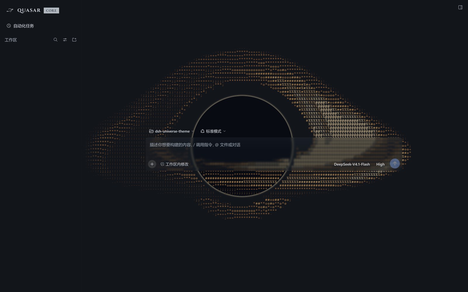
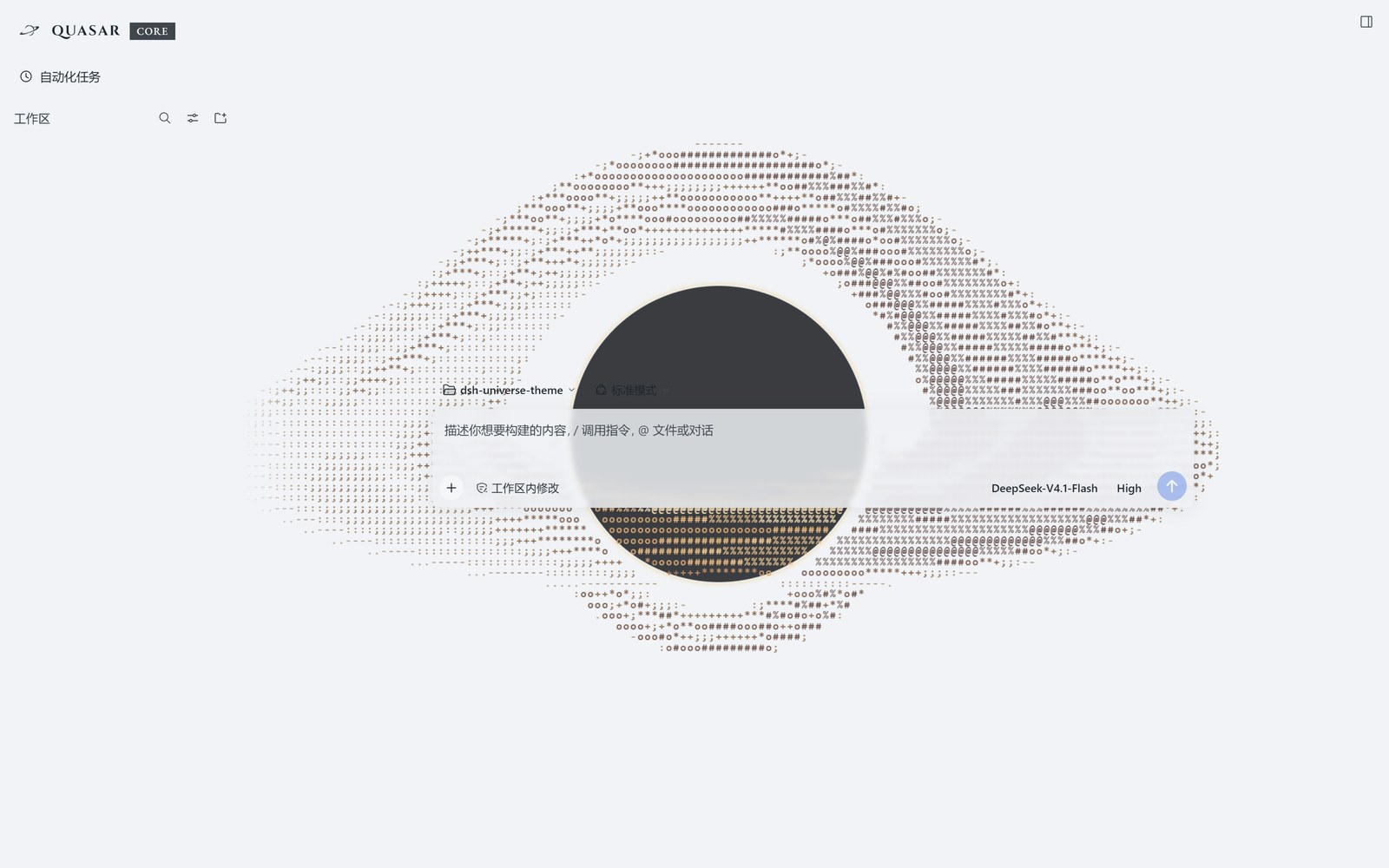
Both captures are the current build, dark and light, at 1600×1000. The conversation list is hidden in both; nothing else is edited.
Requirements
- DeepSeek Harness with a web profile.
- Node.js >= 18 — only for the build and check tools. The theme itself runs in the browser.
Install
From npm — a versioned tarball with the browser bundle already built in:
dsh plugin --profile <profile> add dsh-quasar-theme
Straight from the public repository, which tracks its default branch:
dsh plugin --profile <profile> add github:WhatCannotBeSaid/dsh-quasar-theme
The package carries a prepare script that runs exactly that build, so an
install straight from the Git URL produces the bundle before the package is
linked; the npm tarball ships client.js ready-made and runs no build. From a
local checkout or a clone of it:
npm run build                                   # writes the browser bundle
dsh plugin --profile <profile> add link:<path-to-this-checkout>
Run the build once after cloning: client.js is generated and deliberately not
tracked (see Layout). A plain git clone needs one build — npm run build, or any npm install inside the checkout, which triggers prepare.
The package declares dsh.bundle.patch, so the profile reconciles its bundle
stack against the installed package and mounts the theme. If it does not appear
after a restart, append dsh-quasar-theme to dsh.profile.bundles in the
profile's package.json — a package that is merely a dependency is not mounted.
Remove
dsh plugin --profile <profile> remove dsh-quasar-theme
Drop the entry from dsh.profile.bundles too if you added it there.
What it is
| Modes | Light and dark, one override layer each arm |
| Token layer | 53 measured overrides — 41 in the light arm, 12 in the dark arm |
| Translucent surfaces | Two tokens carry a veil alpha: 0.84 in light, 0.35 in dark. Input cards and menus sit at 0.30 |
| Wallpaper | None. The paint layer and its no-art state are here; no artwork ships, is hotlinked, or is fetched at paint time |
| Black hole | A canvas layer behind the app: a photon ring and shadow, a lensed accretion disk whose 24 patches have finite lifetimes and are sheared by their own differential orbit. Phenomenological, not an MHD solve |
| Brand mark | The ink black hole supplied for this theme, drawn at 28×28 inside the sidebar's 36×36 slot |
| Wordmark | QUASAR in Cinzel 700 (0.10em tracking) and a CORE chip in EB Garamond 500 / 12px, both embedded as data URLs |
| Composer row | The merged model control becomes two independent buttons — model and reasoning effort — each with its own popover, neither with a disclosure chevron |
| Also inside | A pin button on every workspace and session row; a session status rail; the four popovers that hang off the composer row centred on their triggers |
| Language | All user-facing text goes through the official locale service (zh / en) |
The theme installs one layer and can be removed as one. It ships no settings
panel of its own — the look is fixed, not a preference — and the only thing it
persists is the workspace pin set and the composer's collapsed-popover state,
under quasar-theme/workspace-pins and quasar-theme/model-groups-collapsed.
It does hide and move a few official entries, so read
What it changes in the interface before you
install it.
What it changes in the interface
Removing the package takes the layer away again and every official element comes back. In between, the theme hides seven official entries, rewrites the sidebar identity line, removes the new-session page's title row, and reshapes the composer's control row. All of it is CSS plus a few client effects — the official DOM is never rewritten.
The brand row is three click zones
The sidebar brand row reads [ink black hole] QUASAR CORE; the official wordmark and its whale glyph are hidden. It is one official button carrying three zones, decided from the click's x coordinate at click time:
| Click | Opens | Because |
|---|---|---|
the ink mark, left of QUASAR |
the plugin panel | the nav's 「插件」 row is hidden, so this is its only door |
the QUASAR text |
a new session | official behaviour, unchanged |
the CORE chip, right of the text |
Settings | the 「设置」 launcher button is hidden, so this is the visible door to it |
The mark and the chip both drive hidden official controls programmatically: the mark clicks the hidden 「插件」 row, the chip clicks the hidden Settings launcher. When that launcher is absent the chip asks the host's shortcut registry instead. Only the name's stretch is left alone, so the official new-session handler runs there. Keyboard activation (Enter or Space on the focused button) and any click held with a modifier key are left alone. Collapse the sidebar to a rail and there is no brand button, so there are no zones either.
Both embedded faces are SIL OFL 1.1, latin subset, travelling inside client.js
as data URLs, so the row looks the same on a machine that does not have them.
build/fonts.json is the provenance record, and the build fails when a file's
byte count disagrees with it (Cinzel 15,184 B, EB Garamond 25,264 B).
Hidden official entries
| Entry | Where | Way back |
|---|---|---|
| 「应用」/「编辑」 title-bar menu | desktop shell only; absent in a browser | none from inside the app: 关于 / 检查更新 / dsh 命令 / 退出应用 go with it. Quit is still on the tray menu |
| the second 「新会话」 button | sidebar, below the brand row | QUASAR, or Ctrl+N — it is a duplicate |
| the 「插件」 nav row | sidebar | click the ink mark |
| 「设置」 row and its launcher button | sidebar | click the CORE chip, or Ctrl+, |
| 「收起侧栏」 button | left sidebar only; the right sidebar's stays visible | the collapse command itself is untouched |
| the session list's bottom fade | sidebar | it only dimmed the last row |
| the account card (only while the DeepSeek account plugin is enabled) | sidebar, in the Settings slot | removed outright, with no gap left where it stood; the chip still opens Settings |
Where a way back names a keyboard shortcut, that is the desktop default — Ctrl+N
for a new session, Ctrl+, for settings, both of them the official ones,
unchanged by this theme. The web build binds the same two commands to Ctrl+Alt+N
and Ctrl+Alt+,.
Nothing else in the sidebar moves. The workspace and session list keeps the
official flex: 1 scrolling area, and the bottom area still shows whatever a
third-party plugin registers into sidebar.footer.action, in the position the
host gives it.
The nav area sits under the title bar (desktop shell only)
The first nav button is level with the 对话 / 轨迹 tab row of the main area instead of sitting below it, and the Settings row moves underneath the nav instead of above it. That is the one visible reordering in the sidebar, and it applies to the desktop shell only — the browser build has no title-bar strip to align to, so its layout stays the one the host draws.
The new session page (hero)
The host draws one title row above the composer on that page: the whale mark, the
headline 「探索未至之境」 / "Into the Unknown", and a 「预览版」/ "Preview" badge —
the hero.headline and hero.preview strings of the official locale dictionary.
The theme hides that row, so the page is the composer and nothing else. The row
goes entirely rather than having its text emptied: an empty flex row still holds
the HeroShell's gap, which reads as a stray blank band rather than as the composer
having moved up. With the row display: none the composer sits where the headline
used to be. Nothing is put in its place — the theme writes no copy there.
The composer's control row
The row above Send belongs to the host; the theme reshapes it and splits one of its controls.
- The official merged model control becomes two buttons: the model and the reasoning effort. Each has its own popover, and opening one closes the other; neither carries a disclosure chevron, because the open state is already the trigger's own highlight.
- On a narrow row both triggers become 28×28 icon buttons — same box, same ink as the add and dictation buttons beside them. A wide row keeps the text labels.
- The whole row shares one seam — 6px when it has room, 3px when it does not — so the controls read as one strip instead of drifting groups.
- The four official popovers that hang off that row — permission, session stats, token usage and the context meter — are centred on their triggers instead of left-aligned with them. The sidebar's own view-options menu is left where the host puts it.
What the theme adds
- A pin button on every workspace and session row (置顶工作区 / Pin workspace,
following the host's language). The pinned set lives in browser storage under
quasar-theme/workspace-pins; the order it produces is written through the host's own insert-before API, so it survives a restart — and, unlike the pin set, it also survives removing the theme. - The session status rail: blue and breathing while a session waits for you (an approval, a question, a plan review), red while it is the one open in the main area, purple while it finished unread. A pinned row gets a rainbow title instead of a rail.
- The accretion disk behind the app: a black hole with a lensed disk, drawn on a canvas and shaded per cell. Patches are advected by their own orbit, so a patch is sheared into an arc instead of sliding as a block. It holds still for anyone who asked for reduced motion.
- A continuous composer transition: sending the first message of a session slides the composer card down as one move instead of fading it out and popping a new one in.
Settings themselves remain the official dialog. The single change there is that the dim tint behind it is removed; the panel and click-outside-to-close are untouched.
Layout
index.js              host half — mounts, registers no route, plays nothing
client.js             GENERATED browser bundle. Not tracked; build it. Do not edit.
src/client.js         service and effect orchestration
src/theme.css         the token layer
src/tokens.json       the token layer's source of truth for the build
src/runtime/          glass, black hole, geodesic lens, pins, brand routing, panels
src/model-effort-picker.js  the composer's two model/effort controls
cordis.patch.yml      the bundle-patch mount declaration
build/                shipped assets: the brand mark, the two OFL fonts, fonts.json
build/wallpapers.json the TRACKED wallpaper manifest — empty in this repository
tools/                build, self-check, token audit, tests
docs/                 design log, recon, audits, render reports
NOTICE                upstream licences and third-party credits
LICENSE               MIT, plus the font carve-out
client.js is generated from src/ and carries a banner saying so. Edit src/
and run npm run build; the check gate fails if the two drift apart.
build/wallpapers.json is tracked and currently empty. An empty manifest is the
documented no-art state: the build publishes --cp-pick-light: none; --cp-pick-dark: none; and the paint layer draws nothing. A direct: entry would make the build
emit url("https://…") and the browser fetch that host at paint time — nothing in
this repository does that today. out/wallpapers.local.json (git-ignored) can
carry dataUrl: entries for a local build; --mode public ignores it.
Checks
npm run verify
Runs the development gates: syntax checks on both bundle halves, the behavioral and
build-contract tests in tools/*.test.mjs, the static self-check (113 assertions,
all green at this version), the 53-token audit, and an exact artifact/source
comparison. Build and check commands accept the same --mode auto|public|local.
Individual gates: npm run build (writes client.js), npm run check (compares
it against src/ without writing), npm run selfcheck, npm run audit, npm test.
Release validation is npm run verify:release -- --mode public --host-version <exact-version>. Fresh target-host evidence, collection time and input hashes are
required; old dumps without provenance yield a partial development audit, not
verified compatibility. npm run measure:resources measures local compression and
Node compilation, not browser performance. Publish from a clean isolated checkout
without out/, then validate the packed artifact's public mode.
See S1–S10 implementation and acceptance record for limitations and rollback.
Licence
MIT, with one carve-out for the two font files. Nothing in the package is non-commercial, and no third-party artwork ships — the only image is the brand mark drawn for this theme.
| Part | Licence | What it asks of you |
|---|---|---|
Everything else — index.js, src/, tools/, client.js, docs/, both READMEs, build/*.json, the brand mark |
MIT | Keep the copyright and licence notice. Commercial use is fine. |
Fonts — build/cinzel-latin-700.woff2, build/eb-garamond-latin-500.woff2 |
SIL OFL 1.1 | Keep the licence with the font, and do not sell the fonts on their own. The texts ship beside them as build/cinzel-OFL.txt and build/eb-garamond-OFL.txt. |
Full terms: LICENSE. Per-file credits: NOTICE.
Third-party marks and credits
Brand mark. build/brand-mark-black-hole.png, the ink black hole the sidebar
draws, was supplied for this theme and is redistributed under the same MIT grant
as the code. It is not character artwork, it is not derived from anyone else's
picture, and it names no third party. No other image ships.
Fonts. Cinzel, Copyright 2020 The Cinzel Project Authors; EB Garamond,
Copyright 2017 The EB Garamond Project Authors. Both SIL OFL 1.1, latin subset,
from @fontsource, embedded in client.js as data URLs.
No other artwork. No wallpaper, no character illustration and no third-party image is distributed with this package, and nothing is fetched from a third-party host at paint time.
No comments yet. Be the first to write one.