dsh-glass-theme
An Apple Liquid Glass skin for the DeepSeek Harness Web GUI. Every surface in the app is redrawn: floating glass chrome over an ambient light field, an opaque reading surface for the transcript, and one material ladder shared by every panel, popover and dialog.
Pure CSS plus a ~150-line client runtime. Nothing in the shipped app is patched; the skin loads as an ordinary Harness bundle and layers its stylesheets after the app's own.
| Light | Dark |
|---|---|
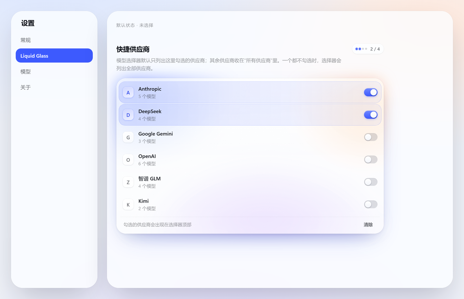 |
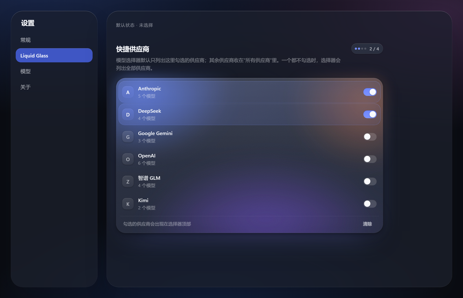 |
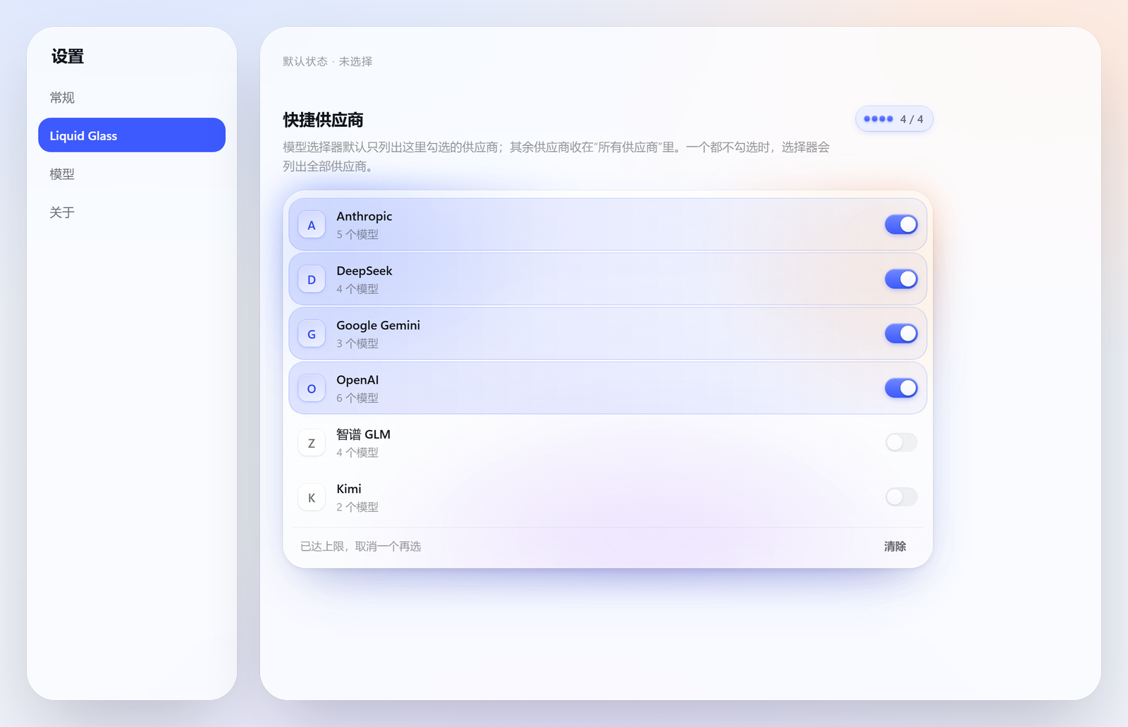
What it does
- Re-keys the app's whole token vocabulary. The shipped theme publishes an
empty token set, so the palette is CSS-only.
src/css/tokens.cssre-declares ~250--dsw-*custom properties onbody(andbody[data-ds-dark-theme]), which makes every page the skin has never heard of inherit the redesign. It also defines 11 properties the shipped build consumes but never defines. - Redraws every surface across 16 sheets: shell, sidebar, conversation, composer, overlays, model, picker, stats, settings, pages, workspace, widgets, motion.
- Replaces the composer's model picker.
src/picker.jsmounts its own React card intoconversation.input.modeland hides the host trigger: grouped providers, a one-line description per model, the reseller price ratio as a badge, a live peak/off-peak chip that follows the SELECTED model's provider (DeepSeek: 工作日 9:00–12:00 + 14:00–18:00, ≈2×; 智谱: 工作日 14:00–18:00, ≈2×; providers without a schedule show no chip), and an inline effort segmented control beside the model list (both visible at once; picking a model keeps the card open). Configured providers narrow the default list; everything else stays behind one "所有供应商" row. Selection feedback is derived from the public directory snapshot: an activation shows pending on the target while the host-confirmedcurrentstays the only checkmark, a failed or rejected command shows a retryable failure note, and an acknowledged command that no projection confirms within 8 seconds shows an explicit unconfirmed note — never an automatic rollback. The all-providers card closes only on acknowledged + confirmed; focus returns to the effort control or the "所有供应商" opener. The catalog distinguishes loading, empty, overall error (retry viaload()), filtered no-match (clear the query), and partial provider failures (a note, not a blocker). - Merges the usage readouts.
src/stats.jsreplaces the two stat pills and the context ring with one control that opens a single panel: context pressure and its three buckets, session timings, and the token ledger. The pill sits at the input box's right edge and the panel hangs off that same right edge. - Adds its own settings page (
settings.section, "Liquid Glass") where the quick-provider list is chosen. The page has one material object — a frosted board lit from inside by its own light field (the settings sheet is already glass; a second card would be glass on glass) — with a capacity meter, glyph tiles, staggered entrance, and etched grain that answersprefers-reduced-transparency. - Adds the 工作空间 workbench (
src/workspace.js, sidebar entrylg-workspace): a whole page answering "what needs me today" across tapd-ai-cli and wecom-cli — my TAPD bugs by severity, stories/tasks, WeCom todos, an attention list (high severity or overdue), WeCom doc search, in-row workflow transitions and owner reassignment, and "start a session here" (pick a directory → create workspace → start session). All CLI execution goes through the package's own fenced host routes (/ws/status,/ws/run,/ws/install: loopback + same-origin fence, subcommand whitelist,spawnwithout a shell, timeouts and output caps); a missing CLI degrades to clearly-marked demo data with a one-click managed install (npm i -g @wecom/cli, or a checksum-verified GitHub download into~/.dsh/binfor tapd). See docs/WORKSPACE.md. - Answers the accessibility questions:
prefers-reduced-transparency,prefers-contrast,prefers-reduced-motion,hover: none, and keyboard-only focus rings (gated on input modality, so a pointer user never sees one). - Styles foreign pages. Third-party plugins render unclassed HTML into the
mainslot; those controls get the app's type and control scale too, without reaching into markdown output.
Install
lib/ is committed, so a clone is ready to load — installing needs no build step.
The releases page carries
the same build as a prebuilt tarball,
dsh-glass-theme.tgz.
Its name is version-free on purpose, so that URL keeps resolving across
releases; storefronts serve it instead of a build-from-source command.
Copy the package into your profile's
node_modules:cp -r . ~/.dsh/profiles/desktop/node_modules/dsh-glass-themeAdd it to that profile's bundle list in
<profile>/package.json:{ "dsh": { "profile": { "bundles": ["dsh-glass-theme"] } } }Restart the Harness.
The restart is not optional: the plugin roster is composed from the profile before the window opens, and the host half (routes, peak-rate cache, usage ledger) is mounted at boot. Nothing in the shipped app is modified — removing the folder and the bundle entry restores the stock interface exactly.
Layout
src/css/               the 16 stylesheets, in cascade order
src/client.js          mounts the sheets, tracks modality, wires the layers
src/catalog.js         the model catalogue: providers, families, descriptions, pricing
src/picker.js          the ported model picker (React, mounted into the model slot)
src/stats.js           the merged context/usage panel
src/settings-section.js the skin's settings page
src/workspace.js       the 工作空间 workbench page (tapd + wecom-cli)
src/host/              the host half: routes, peak-rate catalogue, usage ledger, workspace CLI executor
lib/client.js          build output (generated)
lib/host/              build output of src/host (generated)
vendor/                the reference package's data files and assets (MIT, see LICENSE-reference.txt)
tools/                 build + verification tooling
docs/                  feature documents (WORKSPACE.md)
Build and verify
node tools/verify.mjs       # every selector must resolve against the shipped build
node tools/leak.mjs         # [class*=] must not over-match sibling locals
node tools/build.mjs        # inlines src/css/*.css into lib/client.js, copies the host half
node tools/smoke.mjs        # evaluates the bundle against a stubbed DOM
node tools/style-lifecycle-check.mjs # the sheet mount converges: it stops writing when the document is right
node tools/assert-built.mjs # the authored rules actually survived into lib/client.js
node tools/picker-feedback-check.mjs # picker feedback lifecycle: pending/failure/unconfirmed/catalog states (headless; real React when resolvable, else its own lifecycle harness)
node tools/interaction-check.mjs # isolated browser fixture: layer coordinator, modal Tab containment, Escape hierarchy, picker/stats/workspace/settings keyboard flows, reduced motion
node tools/host-check.mjs   # the host half registers its routes without throwing
node tools/ws-check.mjs     # the workspace CLI routes: fence, whitelist, probe, caps (mock server)
node tools/ws-render.mjs    # source render smoke test, including explicit open-case handlers
node tools/ws-rich-check.mjs # the detail panel's rich description: sanitizer, markdown, show unwrap
node tools/ws-package-check.mjs dsh-glass-theme-0.2.3.tgz # published bundle regression
Live probes (each needs the GUI running; they mint their own auth cookie):
node tools/two-level.mjs                # the picker's three states: unconfigured, configured, the second card
node tools/settings-page.mjs            # the skin's settings page renders, lists providers, and its switches write
node tools/pick-check.mjs               # one row checked, across providers that share a model id
node tools/effort3.mjs                  # the effort segment applies a level
node tools/picker-rows.mjs              # fail if any row lacks a description or its ratio badge is block-level
node tools/chk-chip.mjs                 # the peak/off-peak chip's state and countdown
node tools/meter.mjs --shot G:/tmp/m    # the context meter panel
node tools/stats-dom.mjs --theme light  # the two stat dialogs
node tools/rail.mjs --scan              # the turn rail's hover previews
node tools/wsselect-probe.mjs           # the native <select> computes an opaque background (popup rows stay readable)
verify.mjs is the important one. A skin is nothing but selectors, so a wrong
hash prefix or a renamed local is a silently dead rule — no error, no warning,
just a surface that keeps its old look. The tool resolves every token against
research/shipped-class-map.json (extracted from the installed app) and fails
the build on a miss.
style-lifecycle-check.mjs guards the other half of the mount contract: the
reconcile must be bounded. It runs the built bundle in a stub DOM whose mutation
records deliver asynchronously and counts actual stylesheet DOM writes, so a
mount that keeps moving its own tags and reacting to the records of those moves
cannot pass as "idempotent". Host batches, partial and total sheet removal,
<head> replacement, missing MutationObserver/requestAnimationFrame,
disposal with a repair still queued, and a superseding mount are all covered;
the original defective implementation is preserved inside the tool as scenario 1
and must keep failing to converge, so the defect stays reproducible.
The inventories verify.mjs resolves against
The app generates its CSS-module class names (_local_hash), so the only honest
way to check a selector is against the classes the installed build emits. Those
maps are generated, not committed — they contain the app's own stylesheet text,
which is not ours to redistribute. One step each:
node tools/extract-inventories.mjs --asar "<install>/resources/app.asar"      # shipped classes + attributes
node tools/foreign-inventory.mjs --root ~/.dsh/profiles/desktop/node_modules  # installed plugin classes
Both write into ../research/ — one level above the package, so an installed
copy never carries them. extract-inventories.mjs auto-detects a local install
when --asar is omitted.
assert-built.mjs exists because the bundle escapes its own CSS: each sheet is
embedded as a JSON string, so a newline is the two characters \ n. A regex
written against the source file misses in the bundle for that reason alone —
which looks exactly like a lost rule. The tool unescapes once and then asserts
both the rules that must exist and the ones that must not.
Keyboard navigation and layer coordination
All skin-owned popovers, dialogs, drawers, and menus register with a unified coordinator (src/layers.js). One coordinator instance is scoped to the client session and shared by all skin component factories:
- Top-layer Escape and outside routing: Only the topmost open layer handles an Escape keypress or outside click. Closing a child card (e.g. the picker's all-providers card) leaves the parent layer open.
- Modal containment: Modal layers (workspace dialogs, narrow inspector sheet) contain
TabandShift+Tabwithin their boundaries and mark outside siblingsinert(aria-hiddenfallback). Nonmodal layers (picker, stats panel, project menu, desktop inspector) preserve natural Tab exit to the page. - Focus restoration: Closing a layer via Escape or an action button restores focus to the invoking opener control. Clicking outside dismisses nonmodal surfaces without moving keyboard focus away from whatever element the user activated.
- Display preference and unmounted safety: Closed layers unmount from the DOM. Under
prefers-reduced-motion: reduce, defensive styles ensure closed layers remain hidden (display: none !important), non-hit-testable, and absent from Tab order even during rapid motion-preference toggling.
Documented keyboard interaction paths
| Surface | Activation & Entry | Navigation | Selection / Action | Dismissal & Return |
|---|---|---|---|---|
| Model Picker | Click / Space / Enter on trigger opens card and focuses search input (role="combobox"). |
ArrowDown / ArrowUp cycles active option (aria-activedescendant). ArrowLeft / ArrowRight cycles reasoning effort in the segmented control. |
Enter selects active model. |
Escape closes "所有供应商" second card first (focus returns to opener); second Escape closes main card (focus returns to trigger). Outside click dismisses without moving active focus. Tab exits to next page control. |
| Stats Panel | Click on dock stats pill opens panel; focus moves to panel container (tabIndex="-1"). |
Tab / Shift+Tab navigates internal links and actions. |
Click / Enter on interactive items. | Escape closes panel and restores focus to stats pill. Outside click dismisses without stealing focus. |
| Workspace Project Menu | Click on project trigger opens nonmodal menu. | ArrowDown / ArrowUp or Tab through project items. |
Enter / Space selects project. |
Escape or outside click closes menu and restores focus to project trigger button. |
| Workspace Inspector (Desktop >900px) | Click on item row opens nonmodal side inspector. | Tab moves naturally between inspector actions and main list. |
Click / Enter on action buttons (流转, 转派, 复制 ID). | Escape or "返回列表" closes inspector and restores focus to the item row. |
| Workspace Inspector (Narrow ≤900px) | Click on item row opens modal bottom sheet with blocking scrim. | Tab / Shift+Tab contained strictly inside sheet; outside siblings marked inert. |
Action buttons inside sheet. | Escape, sheet close button, or scrim click dismisses modal, clears inert, and restores focus to the item row opener. Unmounts completely on close. |
| Workspace Dialogs (状态流转, 转派) | Triggered from item actions; modal titled layer opens. | Tab / Shift+Tab contained strictly inside dialog; background inert. |
Form submission / confirm button. | Escape or cancel button closes dialog, clears inert, and restores focus to invoking action button. |
| Settings Drill-down | Click on provider model gear/arrow swaps view to provider models. Focus lands on "返回" button. | Tab through model switches and tool buttons. |
Click / Space toggles model enabled state; "保存" commits changes. | "返回" discards local drafts; "保存" commits. Both return focus to the originating provider row control (or safe heading/switch fallback if provider disappeared). |
Design rules the sheets follow
A page is a reading surface; a control is glass. The transcript column is opaque on purpose — text that scrolls must never sit on a moving blur. It picks up the room's light direction through a very low-alpha gradient instead.
One ladder. Menus are L2, sheets and dialogs are L3, toasts float. Nothing stacks more than two backdrop layers, and nothing is glass on glass.
Large glass gets more fill and less saturation. A 640px dock at 180% saturation turns the ambient field's chroma into a purple wash; the same material at 140% reads as glass.
A floating layer earns its float from its own rim. Over an opaque surface there is nothing to blur, so the 0.5px lit top edge and hairline do the work.
Know what to leave alone. The app's scrollbars, delete-button styling and inline-styled third-party controls are already correct; the skin does not restyle them.
Never style a control by its ARIA role alone. The role lands on whatever element receives the click, not on the painted shape.
role="switch"sits on an 88×20 toolbar button in the shipped app and on a 530×70 full-width row indsh-zhipu-plan; a generic rule painted those rows as accent capsules that swallowed their own labels. Style a control when its own class says what it is, and let a plugin's own design stand when it does not.A list row is a member of its group, not a card in it. When a section header already says "these belong together", a plate behind every row redraws the group once per row — it is the same statement repeated N times, and it eats the row's own horizontal room. Reserve plates for lists of independent cards (schedules, goals); for a grouped list use the header, the whitespace and one state signal per row.
A state signal goes on the thing that changes state. The running job row is told apart by a tinted command and the primitive's spinner, not by a background — a fill would make "running" a surface, which it is not, and would leave nothing louder for the row that is actually selected.
Inline styles win, so measure before believing. The shipped
StateDotsetswidth/heightinline and renders an SVG spinner forongoingbut a::afterdot for every other state. A skin rule cannot resize it, and a fixture that hand-writes the markup will happily "prove" a bug that the app does not have. Copy the real markup into the fixture, then measure.A class can name a modifier, not an element.
xpvNua_fadeTopis not an overlay drawn over the turn rail's ends — it is added to the same div that carriesxpvNua_scroller, so it IS the scroll container. Styling it as if it were a separate overlay (pointer-events: none) disabled every mark inside the rail: it still scrolled, still looked right, and could not be clicked or previewed. Read the markup before styling a name.A shared primitive can reach across sheets.
[role='tooltip']is the right hook for tooltips and also matches the turn rail's hover preview, which is arole="tooltip"reading card that brings its own material. The generic rule cropped it to a 9px radius and a 4px inset. Scope a primitive with:not([class~='…'])— and use~=there, since a*=guard over-matches the card's own child classes.Inject beside a flex column and it becomes a block.
OptionCopyisflex-direction: column, so appending the multiplier badge as a sibling of the model name stretched it to the full row width — a 300px grey bar under every name. The badge had to go INSIDE the name span. When a decorator adds nodes to someone else's React tree, the parent's layout mode decides what the node becomes; put it where its shape is already correct.A wrapping flex row is not a grid. Six provider chips broke 5+1 across two lines, which reads as a mistake and costs the same height a balanced 3+3 does.
grid-template-columns: repeat(3, minmax(0, 1fr))gives equal cells, so the row scans as one control and every chip is the same target size.A number needs a reason, not just a state. 空闲 at 10:00 on a Wednesday and 空闲 on 国庆 are different facts, and a weekday-only rule is wrong on the ~dozen days a year the reader is most likely to check. The price chip carries
data-lg-reason(法定节假日 / 周末 / absent) so a holiday reads as a holiday rather than as a clock that stopped. A year with no holiday table falls back to the weekday rule instead of claiming accuracy it does not have.A card that renders is not a card that works. A portal mounts outside the React tree, a handler can be lost in a port, and
select()can reject while the trigger keeps showing the old model — all invisible in a screenshot.tools/picker-select.mjsdrives a real mouse, asserts the label changed, and then puts the model back, because a probe that leaves the user on a different model has done damage, not measurement. It reads a row's name from its own text nodes: the name span also carries the multiplier badge, so an exact match against the trigger label would never hit.A host half is untested until it has been applied.
apply()only runs at GUI start, and a throw there can take the whole app down — but the GUI under test is the one serving the conversation, so "restart and see" is not a test.tools/host-check.mjsruns the realapply(ctx)against a recording stub and asserts the routes it registers; it is what turns a launch-time crash into a line of output.A service must be declared before it can be used.
ctx.slotsis only an accessor when the bundle exports it ininject; withoutinject: ['slots']the call throws inside atry, the page never appears, and nothing is logged where a user would look. A slot's owninjectis an INJECTOR FUNCTION, not a list — an array registers a section that renders nothing and reports nothing.An entry at the end of a scroll is an entry most users never see. The effort row and the "所有供应商" door were rows inside the scrolling body, so they sat ~1300px below the viewport once a 28-model provider was listed. They moved into a footer outside the scroll area: a control is not the last row of a table.
A projection is not the store.
projections.faceOf('modelSelection')returns a flattened summary with nogroups; the provider list only exists onctx.get('modelDirectories').directoryFor(session).store.getSnapshot(). The picker already read it the second way, which is why the composer showed six providers while the settings page showed none.A native
<select>popup is painted from the control, not the page. Write the options, style the rows, and click it. Chrome fills the open list with the<select>'s own background and copies a transparent one verbatim — no themed fallback (internal_popup_menu.cc) — so a control whose background token does not resolve opens a white list of dark-theme text: every option present and unreadable.color-scheme: darkdoes not help; it only reaches the controls the browser draws itself (checkboxes, scrollbars, date pickers). The two rules that do are an opaquebackground-coloron the select and an explicitoption { background-color; color }, which the popup honours per row. A screenshot of the closed control proves nothing here — 0.3.1 shipped a dropdown whose options only became invisible after the click.A child process gets a closed stdin, always.
spawndefaults to a pipe for stdin that nobody writes and nobody ends. Any CLI command that reads it (tapd bug update,story update) blocks forever, so the 25 s timeout kills it and the UI reports退出码 1with empty stdout, empty stderr — a failure with no evidence. Measured on tapd 1.0.0: 0.5 s withstdio: ["ignore", …], never returns with the default pipe. Reading commands hide the bug because they never touch stdin; only writes hand the user a blank error.A
<button>with an emptyonClickis a lie, and a helper outside the component cannot close over its state. The four focus cards were real buttons, styled with hover, wired to nothing — the panel looked broken without saying so. The first fix referencedsetTabfrom a helper defined outside the component, so every click threwReferenceError: setTab is not definedand the page sat still: an exception is not a no-op, but it reads like one. Pass the setter in, and give the render test the same source-level assertion that the click path you just wrote is the one in the file.Display normalisation must not reach the write path. TAPD stores multiple owners as
甲;乙, and the mappedownerwas tidied to甲, 乙for the row meta. The 转派 dialog prefilled that tidied string and sent it back unchanged, so one click turned two owners into a single owner literally named甲, 乙(verified on bug1145368483001012673, then restored). Keep the raw value beside the display value, prefill with the raw one, and convert separators only when the user actually typed them.A control that lives only inside a transient banner disappears with the banner. The TAPD project
<select>lived in the login banner, and the banner folded itself away exactly when a project was configured — so the control that changes projects vanished at the moment a project first existed. Instruments the user needs repeatedly belong in permanent chrome (the toolbar switcher), not in a surface that exists to ask for something once. Check the empty state and the filled state separately: a banner is allowed to be absent, a switch is not.Glass is a material for instruments, not for lists. The pane is opaque and scrolls; one static ambient light field sits behind it (
.lgws-ambient, blurred radial gradients,aria-hidden); the toolbar pill, project menu, count cards and dialogs float over that field withbackdrop-filter: blur() saturate()plus a translucent fill, a 0.5px top specular and a 0.5px hairline. Rows, inputs and search fields stay opaque: frosting dense text costs legibility and buys nothing. Concentric radii (inner = outer − padding), press feedback 0 ms in and eased out, and real answers forprefers-reduced-transparency,prefers-contrastandprefers-reduced-motion— a sheet that ignores them is a screenshot, not an interface.
No comments yet. Be the first to write one.